What I need to do is make bullet points for light room for last week and this week as well.
I was thinking while Rebecca was talking that I might make my final project in to a poster maybe? possible idea. I asked wither we could do more than the 4 photos allocated in the course outline for final project and we are allowed to, The 4 photos was just a guideline. That is good news, keeps some options open.
Next in class we went over what is expected from our seminars/presentations at the end of this term. Both Rebecca and Marie showed us a presentation that they have done in the past. Rebeccas one gave me an idea of pre recording my voice for the presentation because I am terrible in speaking in front of a group of people, which is ironic considering that I am contemplating becoming a teacher.
These are good things to contemplate while we are preparing for the presentation.
In break I had a try at making a blurry background again because I didn't do so well last week when I tried it,
After some help from Rebecca I managed to pull this one of, She explained that the way my lens is made it wont get a low enough aperture to get a full blur and that I need the Object that needs to be in focus really close to the lens.
Iso: 400
Aperture: 4.5
Shutter: 1/60
Sam just got her camera over the weekend so we were just playing around for these shots but i see now that I needed to bumb the ISO up because it is a little dark. all though i actually like the way it looks.
In class we were learning about viewpoint and, fore, mid and back ground Photography shots.
These are screenshots off of Rebeccas blogs that was explaining what these shots look like.
This was my favourite from Maries presentation. I love the creepy feel. It is also a very beautiful shot.
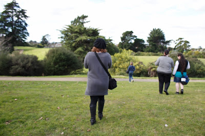
After lunch we went out as a class into the creek to take our own view point photos, I started of sharing my camera with Tahanga and Lily but Tahanga broke off and joined up with Sam because it is hard to share a camera with to many people. Between me and Lily we took nearly 90 photos, some are pretty bad but there was some really nice ones as well.
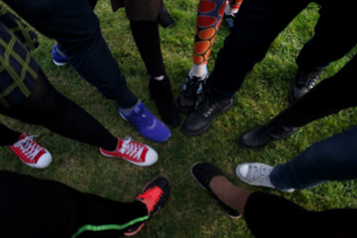
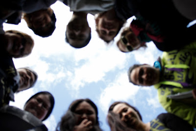
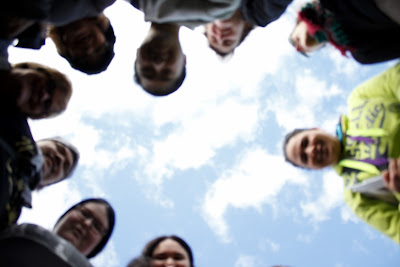
These are the photos that I took that I liked it is a pity that the camera wasnt in focus in the circle photos but they all have their charm. I noticed in the foot photos that i forgot to stick in my foot. but i believe that these two different photos are good examples of different view points. with the faces we had put my camera on a timer so we could put it on the ground. and as the photos progress, you can see that our faces were pulling a way because the camera didnt stop taking photos. That was super awkward.
We went straight into the computer labs after this so that we could start the editing side of light room.
These are just screen shots of some of the controls i was goofing around with.
I have to admit that I do like some of the editing controls of lightroom but I could see a lot of room for improvements.
Ill try to bulletpoint the pro's and cons of lightroom in my next blog thanks for reading.


A poster sounds like a good idea, I look forward to seeing if your project goes down this path
ReplyDelete